
9 Important Rules for Clean and Simple Website Design
Have you ever looked at a website and thought to yourself, “What on earth were they thinking?”Website design can be challenging. You want it to be simple and clean, but you also don't want it to look boring.
If you're thinking of creating a website or are in the process of designing one, there are some important things to keep in mind. People frequently concentrate on visuals and features without considering how unpolished and basic their design is.
So how do you achieve the perfect balance? Follow these nine rules for clean and simple website design, and you'll be on your way!
1. Typography is Important (Here's Why)
Fonts are crucial because different fonts evoke different emotions; wouldn't it be unfortunate if you used Comic Sans on your wedding website? Just kidding! The point is that fonts can be used effectively or inadvertently, just like anything else. Because of their size, weight, and style, certain fonts can lead to lost conversions, as the wrong type may distract consumers from the content they came to see.
For one thing, if you utilized Arial on a website with a lot of text, it might be difficult for some people to read because it isn't as easy to read as Verdana (your eyes can adjust quickly and you won't feel like your eyeballs are going to pop out of your skull) – or even Impact, which was popular for a while due to its “edgy” look. If you're not sure which font is best for your website, consider using two or three different fonts and testing them to see which performs best.
I'm sure most designers know what I'm talking about when I mention poor font choices, but sometimes we're all guilty of making them, too! Just remember that each font has its place and purpose; don't overdo things by slapping every style out there onto one page, and don't stick with just one font either, because that can be boring as well. The rule of thumb is no more than two fonts. You can always change the color and weight for more variety.
2. White Space is Your Friend, My Friend
Too much “stuff” on your website might overload visitors, causing them to click away swiftly since this generally implies that nothing is really essential or interesting enough. People simply don't have the time to investigate every alternative meticulously. If you present everything at once, you can expect it to be overlooked by most people interested in what you offer, because they won't know where to begin or what's most important without scrolling back and forth until something catches their attention.
Patience is a virtue; allow elements to breathe by providing additional spacing between links, images, and other elements. Because people are viewing your material on a variety of devices/platforms, make sure it's adaptable if they want to see everything in list format, for example. I've seen way too many websites recently with insufficient space between each section that it makes me dizzy just looking at them; the contents blur together, and my brain can't focus on anything specific.
Is everything squished together on your site like sardines in a can? If so, then that needs to change ASAP! Please, for everyone's sake.
Do not distract your visitors
It's vital to maintain a reasonable amount of white space so the eye isn't fatigued when scanning, while also highlighting content that is more important than other pieces on the page. Having too many, or even worse, no pictures at all, can be detrimental and distracting, resulting in fewer visitors and lower revenue. There's no need to have too many elements on your site, as this can lead to confusion and make it hard to know where to focus first. Please remove ornamental clutter that detracts from what's truly essential: providing value!
3. Do not use cheesy stock photos or images
Cheaper stock images can look amateurish and cheap, which may harm your brand. If they do not convey professionalism or eye-catching graphics, your visitors will be turned off. Not to mention that low-quality photos don't inspire confidence in the information; you may as well try again with something new!
Counterpoint! The use of stock photos may genuinely assist your business in gaining individuality and authenticity–after all, pictures have a thousand words, right? These images should not only appear authentic but also demonstrate the types of materials available on the website. On a different note, keep in mind that if you use simple stock images correctly, they might always add value (and these ideas will undoubtedly assist). Because it allows any visitor to your page to create their own story.

4. Do not use excessive banner advertisements
Banner advertising may be intrusive and unappealing. The major drawback of banner ads is that too many on a single page can be overwhelming and divert users' attention from what your site is intended to advertise. Seriously. Have you ever gotten frustrated and left a website because there were simply too many advertisements to view the content you initially came for?
At first, you might question why bother with banners if they are so intrusive. There is some good news: You may use them as long as they do not affect the customer experience or divert visitors' attention from what's most important on each page. Experiment with sizes; banner photographs look better when made smaller, since anything larger isn't viewable on most screens.
Even the least experienced users have learned to ignore banner ads, so you'll be wasting valuable website space. Instead, provide more useful content and integrate relevant affiliate links, so your visitors feel motivated to buy rather than being compelled to do so.

5. Create simple and easy-to-understand navigation.
Navigational links should be simple to find and utilize. This is a simple approach to making your website more user-friendly: in the main menu or side navigation, ensure all links are clearly labeled and logically structured.
If someone is lost, they won't know what's going on with the overall structure, which means no conversions will occur because people usually come with a specific goal in mind when visiting a professional page, such as “find out more about these services” or “browse their goods.” The cleaner and simpler your navigation is, the easier it is to funnel visitors towards their desired goal.
Implement easy-to-use navigation by using short, clear descriptions for each link and ensuring they stand out so users can see them. In addition, place the most important links in areas where they'll be most visible, such as the header or footer.
A user-friendly menu will help your visitors navigate the site quickly. If multi-tiered drop-down menus are difficult to use, they're not attractive.
Visitors will leave if your site's navigation is too complex. A one-page menu that uses text rather than images or animations to guide visitors through their choices is a good way to keep it simple and straightforward.
Our eyes are constantly drawn to the core of a website. A good principle for web page designers is to place images where they are easily visible in most computer monitors' windows, typically in the upper half.
If your homepage includes a few lines of explanation for an image, the rest of the page should build on this concept without distracting readers. People will want to learn more if additional material is accessible, but nothing should appear too flashy; all you need is high-quality content that offers basic information about your service, product(s), pricing, or company.
It's essential to strike a balance between form and content. It's time for me to discuss.
6. Design Hierarchy
This is merely another approach to making your website more user-friendly – if each component has a purpose, visitors will understand what's happening before they ever get to the “about us” page. A designer must carefully consider how visitors should perceive specific elements first vs. last, since some elements require more attention than others. This also applies to gallery previews, email submission forms, and feedback buttons. The homepage, like everything else on the website, should be basic and uncluttered. However, instead of being overwhelmed by what's currently happening on the page, they should be able to focus on what's most essential first.
Engage your users by making it easy for them to find their way around
Ensure your users know where they are on the site. We all get lost from time to time, and it's critical to make things simple for people so that their visit with you is pleasant and seamless!
Don't provide visitors with too many options. To achieve the highest conversion rate, ensure each part of your website has clear markers indicating where it begins so people know what they're looking at and how far into the content it goes!
Keep your content up to date, relevant, and accurate; make it as simple as possible for visitors; avoid using too many images or animations (or anything else that may divert their attention); remember to test your site on mobile devices like smartphones and tablets before launching. Yes, I'll keep saying that last statement until the end of time. It's fine; I'm not sorry.
7. Just Say No to Autoplay
Use audio sparingly on your site to keep visitors engaged and returning. If a visitor is going to spend a long time reading all of your content, they should not be irritated by an audio loop repeating itself over and over!
If you plan to use video, ensure it is high-quality and relevant to your site's purpose. Do not post a homemade video just because you think it's cute – only do so if it is directly related to what you're offering and will help engage the user.
Never play audio automatically without first giving users the option to turn it off; autoplay is intrusive and unpleasant on mobile devices.

8. Consider Compatibility and Cross-Device Usage!
With more individuals using smaller devices to access information, it's crucial to consider not only the design process but also the long-term lifecycle of your website and how you want it to function. When it comes to designing, one of the most frequent questions I'm asked is “How do you design for a mobile device?” To answer this question, I'll address one point: What type of interaction can users expect from their website? I've seen websites where everything is crammed together, as though it doesn't matter (because there isn't enough room), making things difficult for visitors who just want something straightforward and easy to understand at a quick glance – such as what you would anticipate from a respectable website.
It's crucial to remember that responsive design is no longer a nice-to-have in 2026; it's a necessity given the growing number of people without access to desktop or laptop computers. It's also critical to think about how people will use your website on their phones. Because they are now the most frequent way for individuals to access the internet, even those who have been surfing the web all of their lives, it's important to consider how they would utilize it. Consider how you engage with information on a daily basis. It's probably on your phone while waiting in line.
Most people today use mobile devices to access the internet. This means that your website should be compatible with Apple and Android smartphones and tablets. Check whether any buttons, text, or other elements on your pages can be safely tapped or clicked.
The bottom line is to ensure that everything appears to be great across all devices/platforms, otherwise, conversions could be jeopardized depending on the site's intended use.
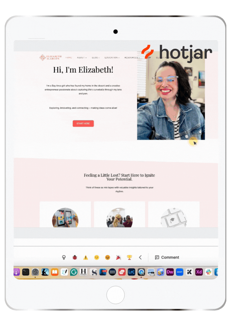
Use tools like Hotjar to track visitor activity and analyze how your website is performing. Test your site across a range of devices before going live to ensure that minor code errors do not degrade the UX.
9. Keep It Simple and Know When It's Time To Hire a Designer
There are many free resources available on the web, or you may hire a professional website designer to help you develop something that best represents your company and brand! You should make your site as simple, mobile-friendly, and accessible as possible. It's critical that your contact information is always visible so visitors can reach you with any questions or to place an order.
All of this can be handled effectively with straightforward design components, so think carefully before diving in. Review what works for high-traffic websites and see how other webmasters (yes, I'm showing my age) market their sites.
There are numerous sorts of websites, but they all have certain features. Many businesses have achieved success by keeping it simple. Before investing more money in frills and whistles, consider what you truly need to get started and whether it is feasible to add extra capabilities along the way.
Take the time necessary to get your website up and running smoothly. Remember that your site should represent your brand, so take your time to get it just right! If done creatively and with attention, it may help you achieve your goals!

Conclusion
There's no such thing as a flawless website, but you can always enhance it depending on how much effort you're willing to put in! There is a lot to consider when it comes to website design; however, I hope that I've made your life easier by providing some pointers on how to make the best decisions for your business.
THIS SITE USES AFFILIATE LINKS. THERE’S NO EXTRA COST TO YOU, BUT I RECEIVE A SMALL COMMISSION WHEN YOU USE THEM.
PIN ME!


💁🏻♀️ Community Guidelines
To ensure a positive and respectful environment for everyone, please review our Community Guidelines. Following these guidelines helps us maintain a safe space for all.
🤖 TL;DR: Keep it cute or keep it on mute. 💅🏼